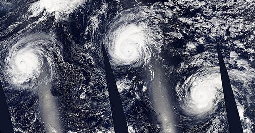
Gallery: Tracking a Trio of Storms
Talking about the weather is usually the worst kind of small talk, and sometimes the topic is tapped for more breathless news coverage than it deserves. But life in the middle of the ocean has been especially interesting this summer, and the headlines are certainly earned.
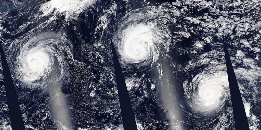
This week, for the first time on record, there are three powerful hurricanes creeping across the Pacific: Kilo, Ignacio, and Jimena. Kilo passed south of the main Hawaiian Islands over a week ago, Jimena is passing north of us, and Ignacio is fortunately far away and weakening.
That's not to say Hawaii has been spared stormy weather. It's top of mind for me today as a sudden downpour once again flooded the building where I work, prompting an evacuation. The local news is featuring an endless stream of photos and videos posted to social media of flooded roads, unexpected waterfalls, and general mayhem. I shared some flood updates updates myself.
But what I've really enjoyed -- insofar as one can enjoy potentially catastrophic weather -- is some of the satellite, radar, and other meteorological imagery that's being generated.
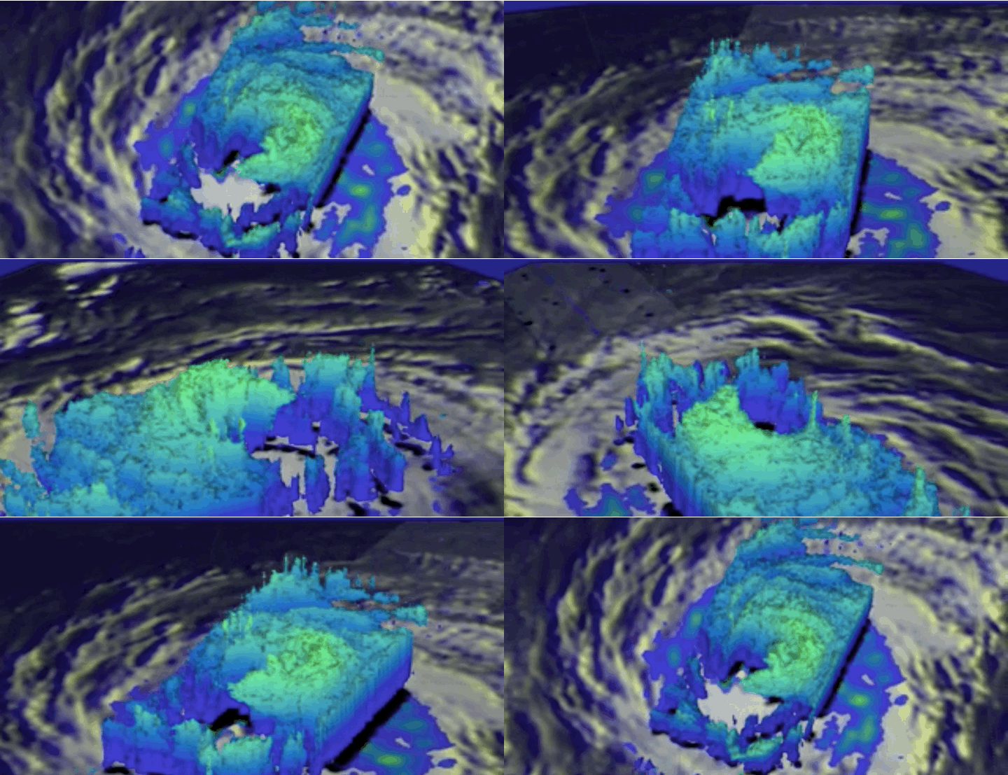
Above, a striking image just posted today by NASA, stitching together several passes of its Aqua satellite to show all three storms. Hawaii is barely visible below Ignacio in the middle. NASA also posted a short video taken with the Global Precipitation Measurement satellite it jointly operates with Japan showing the wall of the eye of Ignacio falling apart.
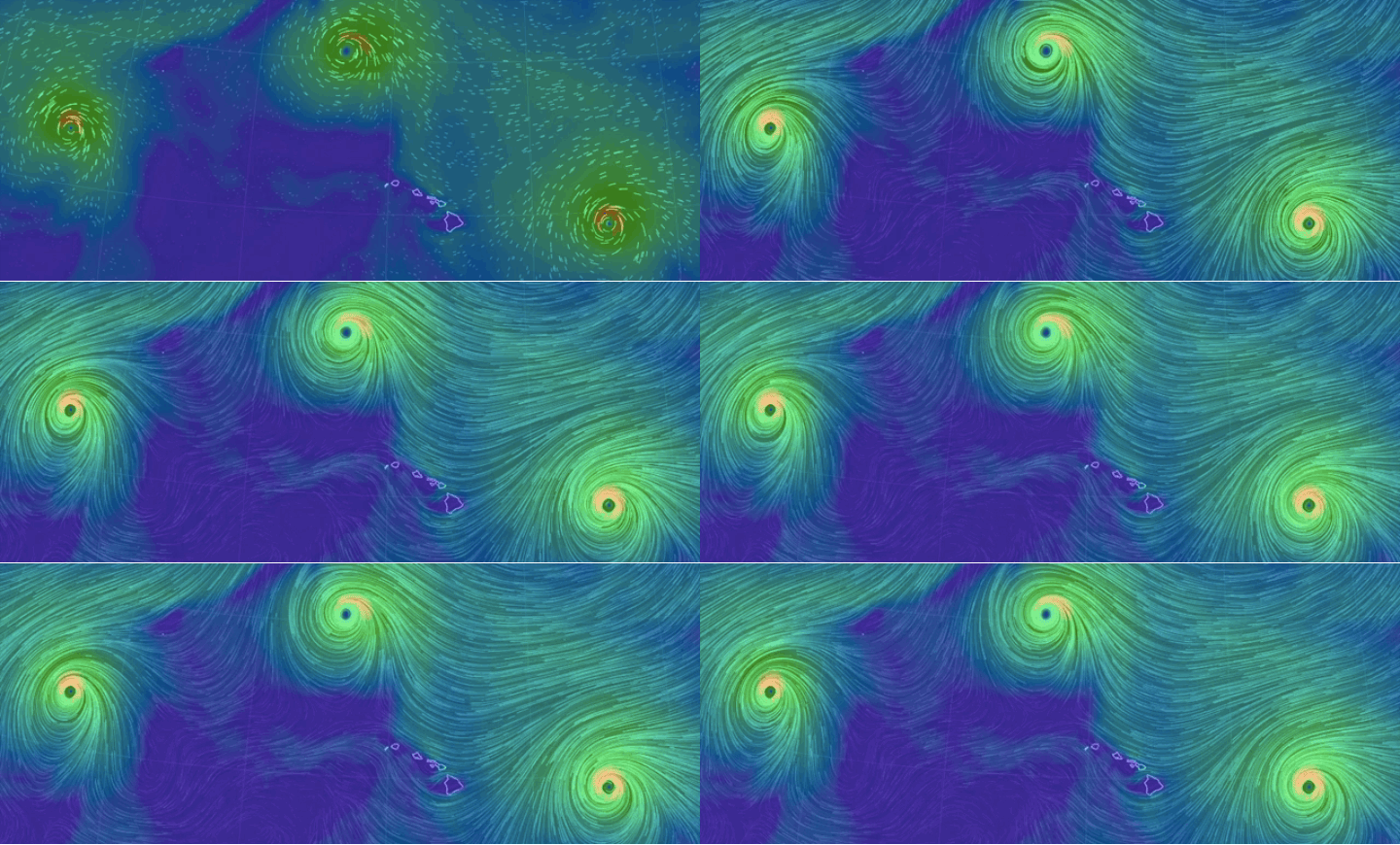
With the three storms in the neighborhood, I've also enjoyed visiting Cameron Beccario's Earth Wind Map. Based on open-source code and launched in December 2013, it's still one of my favorite weather visualizations.
When I shared the Earth Wind Map on Twitter, another user encouraged me to check out MeteoEarth. What it lacked in elegance it made up for in boldness, adding the rotation of the Earth (and the movement of sunlight across the planet).
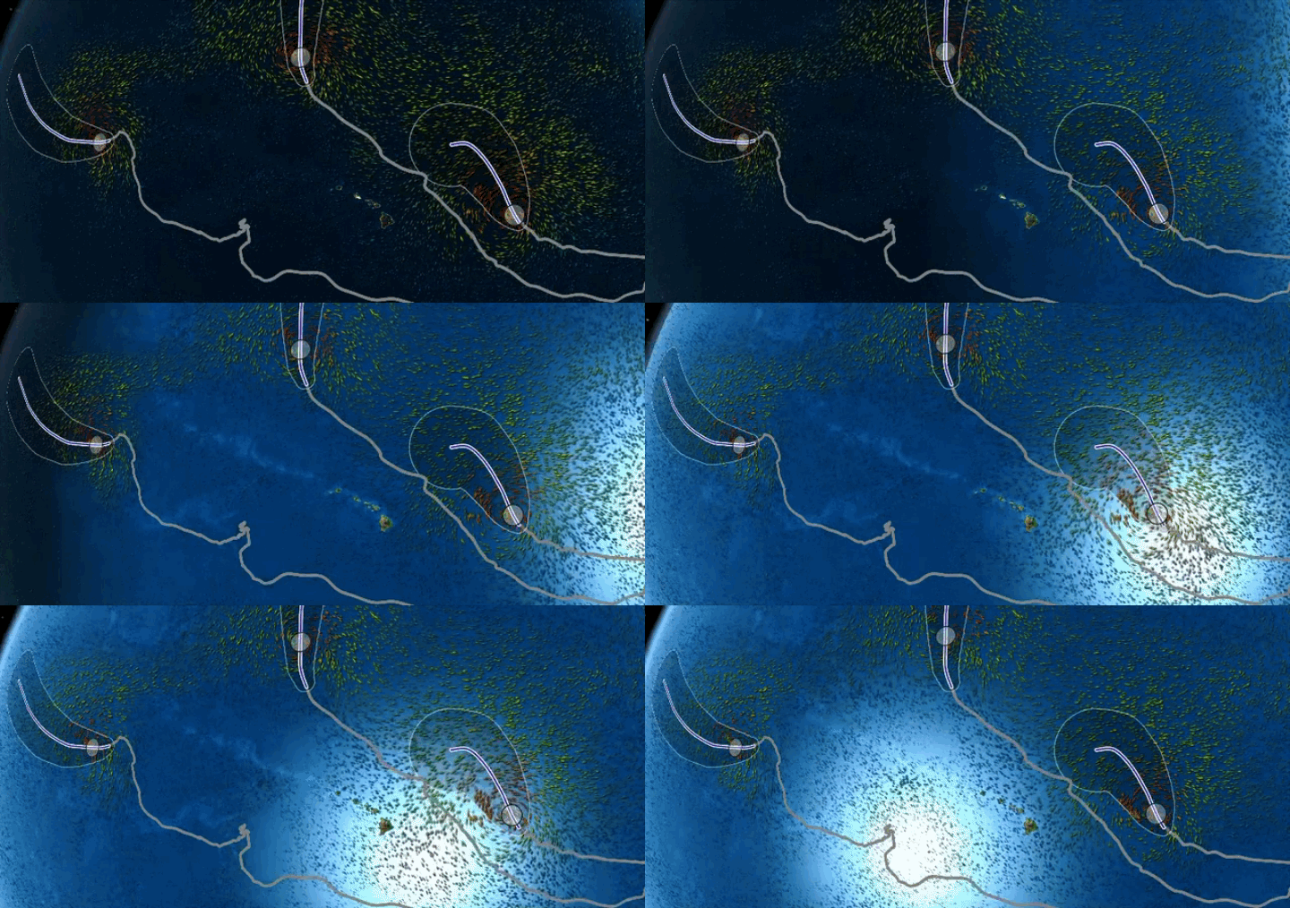
Of course, pretty only gets you so far. Sometimes you need some serious science.
A recent obsession of mine has been the compilation of different storm track predictions onto a single map. While we've seen projected storm paths for years (which simplify things to a single line, spreading out into an ever wider 'cone of uncertainty'), they're really the average of different algorithms and models. And while many of these individual predictions line up with each other, a few take more risks. There always seems to be one model that predicts that every storm will make a complete U-turn any moment now.
I haven't been able to find the ones I've been seeing on the news, which are considerably more colorful, but there is NOAA's Earth Systems Research Laboratory and its "experimental" tropical cyclone track map, which has a complex interactive map with acronyms I've never seen before. But you can get the general gist of what it does.
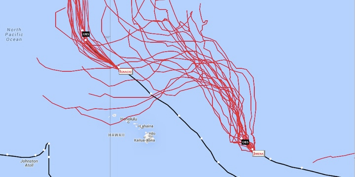
And when I'm interested in more serious weather watching, I always fall back to the classics. The Central Pacific Hurricane Center is the first stop for many people. There's the Hawaii imagery that comes from NOAA's GOES geostationary satellite , and the Hawaii imagery from the National Weather Service's Weather Forecast Office.
The WFO page is the source of the weather imagery I post most often: the four-kilometer infrared satellite loop, which they make available in a number of formats... including a ready-to-share animated GIF.
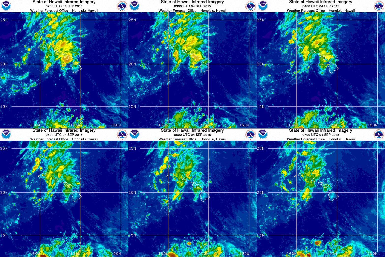
And really, who doesn't love animated GIFs?


